We are coming up on our last month in Digital Media and have been focusing on critiquing spreads and different graphic designs. I have found 4 great examples of graphic design. Two of which, are websites, and the other two are logos. I had some magazines that I was going to use, but I think I recycled them on accident. Anyway, here are some good forms of graphic designs:
Websites
1) Apple
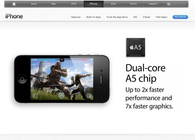
Apple is one of the most successful businesses in the world, and they are good at what they do. They are known for visually amazing products and advertisements. If you have ever bought an Apple product, you may notice the perfection and precision in their manufacturing. Putting their products aside, their ads and websites match what they make beautifully. I am going to make this short since I could write and entire blog about Apple, but if you just look at their advertisements and website, you notice one thing, WHITE SPACE. It is one of the many things we have learned about graphic design, and it is very important too. White space fills in and directs you toward the primary element on the page. Apple uses white space like no ones business. With all the white space, it brings your entire focus on the big picture, which is what they are trying to sell you.
BlueXephos, better known as The Yogscast, is one of the world’s most popular gaming commentators. The Yogscast consists of Simon and Lewis from the United Kingdom. Not only are they hilarious, but their YouTube’s Channel art is amazing. Although it was probably the work of devoted fans, it is still my favorite channel art ever. I have spent more than 8 hours on a YouTube background myself, and it can’t compare to theirs. If you are a fan of their videos, you will understand some of the art. Those of you who don’t, your missing out.
Logos
1) Mozilla Firefox
Mozilla has a very interesting logo. I have always liked it because of the colors and quality of such a small logo. I really like putting a lot of visual effects into something small, its gives a great result. Back in 2002, their logo was much more rustic and looked mainly hand drawn, then again they were not the #2 web browser, so they have an excuse.
2) Starbucks
Recently Starbucks has changed its logo. That means, new cups, new napkins, new signs/billboards, etc. in all of its stores. I hadn’t really noticed anything different in the effect of the new design, other than the fact that they removed the text. After the lesson in digital media on emphasis and balance, it caught my eye and I understood why they did this now. They are trying to force less emphasis on the “Starbucks Coffee” and more on their original logo. That way, you notice the logo more and it gives it more emphasis. An example of another company doing this would be Nike. In their original logo, it said “nike” across their famous whoosh, but now it is removed. If you think about it, when you see an athlete sponsoring Nike, you immediately recognize its Nike because of their signature logo, not the text. That is exactly what Starbucks is doing here.


